Aallto Wellness Oy
Making wellbeing appealing for a wider audience
Brief
A new company in the wellness industry, Aallto Wellness Oy, was in need of a visual design for their brand, including the logo and visual identity to bring the company’s vision into reality. Other aspect of company branding that were also included in the project were the branding guidelines and an application mockup.
Aallto
Aallto is a company focusing on the wellbeing of companies and their employees as a source of sustainable competitive advantage. Their goal is to appear as the more rugged wellness service option compared to their competition. Aallto feels that many office worker, such as developers, would not get help to maintain their wellbeing due to them not being attracted by tranquil yoga imagery in the mountains, which seems to be the standard in the industry. However, these office workers are one of the major groups of people in need of such wellness services that Aallto provides.
Logo
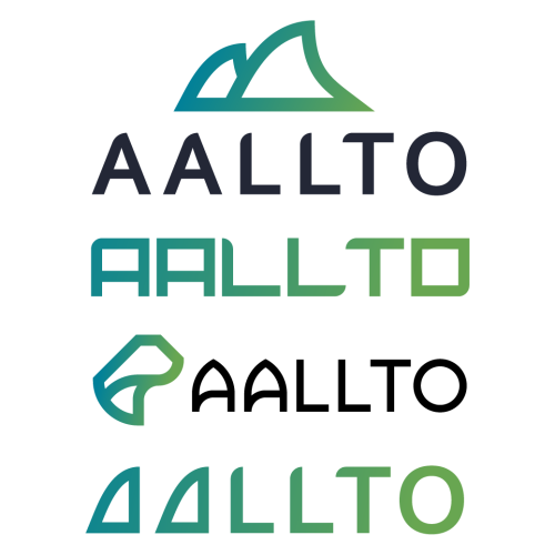
To achieve the vision for the company in logo design, I decided that the logo needs to be angular, which communicates sturdiness and reliability, but still feel dynamic. This dynamic feeling was achieved by the angle present in the first letters and continued by the negative space left in between the different sections of each letter. The color of the logo, a gradient from blue to green, represents the colors of a vibrant ocean, which is where the company wants to mentally take their customers.

Visual identity
The main goals for the visual identity was to capture the ruggedness and ocean theming behind the company image, here I elaborate on a few aspect of the visual identity.
Color
The color choices for the identity was to focus on the blues and greens especially due to their connections to such traits as balance, stability, trust and growth. However, yellow hues are often also present in ocean imagery and can be used very effectively with the brand as well due to its connection to such emotions such as enthusiasm and optimism.
Shapes
Any forms and elements used outside of the imagery should be aimed to be angular. This creates visual interest through contrast against the fluid forms of the wave imagery, as well as highlights the reliability of the brand.
Imagery
The images used in conjunction with the brand are ocean themed as the company name is a slightly modified version of the Finnish word for ‘Wave’. Additionally, the images should strive to be dynamic and active to capture that part of the brand identity.
Mockup
During this project I also created an application mockup with a simple one page prototype of what their application could look like. The front page was built to show the most important wellness-related information with simple visualizations and suggestions for improvement.
Process
This is the basic process I follow with most of my design work. Usually I finalize the visual identity after creating the final logo because then I finally feel like I have all the information needed to connect everything together. After this process I move to any additional work needed, such as creating mockups. This process changes only marginally between projects, which means that this section is also very similar to the process sections of the other cases but with minor differences based on the project.
1. Discussion and Benchmarking
Finding out the goals of the project and benchmarking competing companies to further narrow down the best approach.
2. Initial Ideation
Creation of initial logo ideas and conceptualizing them to have several possible directions for the logo to develop in. These ideas were then presented to the client and the best ones were chosen for further development.
3. Revision Rounds and Final Logo
The aim for this step is to keep narrowing down the logo ideas to the best ones and developing those even further until the final logo design is reached. Number of revisions depends on the project and some of this project’s earlier logo revisions can be found right under this section.
4. Finalizing the Visual Identity
After getting the logo ready the next step was to create a suitable visual identity to match the message infused in the logo considering such things as colors, shapes and imagery while still keeping in mind the usability and applicability of those guidelines. These guidelines were then further utilized in creating the other parts of the commissioned project.
5. Creating Other Components
The main thing Aallto needed in addition to creating the logo and visual identity for their company was an application mockup. The client had a list of features they wanted their application front page to show to the user and I was responsible for creating the user interface and present it in an attractive way. This was done by first sketching the first ideas as a paper prototype and moving on to creating the UI and mockup after getting the idea approved.


What I learned?
The most important thing I learned during this project is that it is beneficial to have extended conversation with the client to have a better understanding of the goals for the business concept and visual identity. This adds to the base knowledge that a standard brief can provide and allowed me to more confidently pursue a certain vision. Additionally, it made it easier for the customers to understand the meanings behind the design when we had clarified the baseline together.
There are however a couple of things I might want to do differently in my future projects. Even though I didn’t share them here, the branding guidelines should strive to be applicable to as many situations as possible and even though I included all the basic information such as logo and its clear space, colors, fonts, assets and other tips, such as use of contrast, I would want to still add a darker color to the color palette and more clear guidelines in what kinds of images to use with the brand. The latter was left out due to the strong vision of the client and even though I provided example images to get started with, it would still be preferably included in the document for future-proofing purposes.
Testimonial

Lauri was a pleasure to work with and he helped our visions for the company come to life. The quality of work was great, and we appreciated the transparent design process. I can warmly recommend Lauri as a designer.
Lauri Peltola, Director Of Sales And Business Development at Aallto