KYL70
A celebration of traditions, both old and new
Brief
2019 was a celebratory year for Academic Male Choir (KYL) as they turned 70 years old. For this occasion we wanted to create a celebratory ‘KYL70’ brand for the choir that would be used to market the events throughout the year and upgrade some of our physical promotional material, such as rollups and banners, in the process.
My role
During this year I functioned as the choir’s art director and was also part of the board of directors where we created a plan for this celebratory year. My role in this project was mainly to create the logo and visual identity for the KYL70 brand and use it throughout the year to create a coherent and recognizable style that our listeners could recognize as part of the year of celebration.
KYL
KYL, also known as Helsinki Academic Male Choir, is a traditional Finnish male choir founded in 1949. KYL is the male choir of the Student Union of Aalto University School of Business and consists mostly, but not exclusively, of current and former students of the school. The choir has won many international competition and strives to be an energetic and recognizable part of Finnish music establishment.

Logo
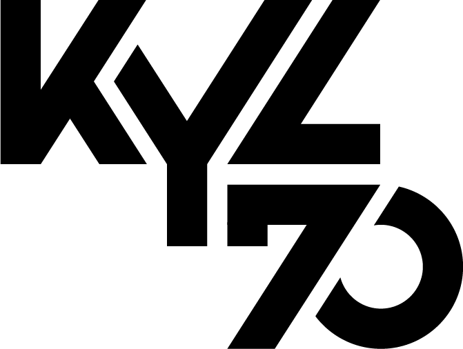
The logo that I created for the brand needed to be powerful and easily recognizable, which is why a concise and bold text logo was chosen. The thick letters and sharp shapes communicate both stability and boldness. Additionally, the unevenness represents traits such as creativity and willingness to go outside of the comfort zone, which is something KYL thrives in.

Visual identity
Plain and simple, the visual identity aimed to be recognizable and bold. This is mirrored in the simple but effective visual style that on its base level only including the main asset and the logo, which are then used in numerous ways during the year.
Color
The colors of the brand, gold and green come directly from the traditional colors of KY, the Student union of Aalto University School of Business. The reasoning behind this decision is that though the choir is always aiming for the next big thing, the traditions will never be forgotten.
Shapes
The bold shapes of the logo are used in the other designs, such as on the pages of the concert program booklets. Additionally, the main asset, the explosion, creates an interesting contrast and against these bold shapes.
Imagery
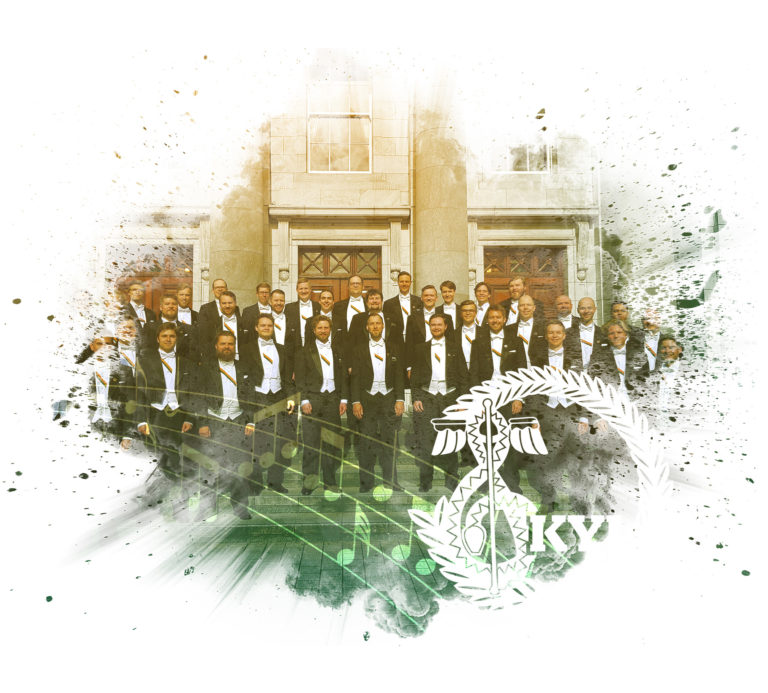
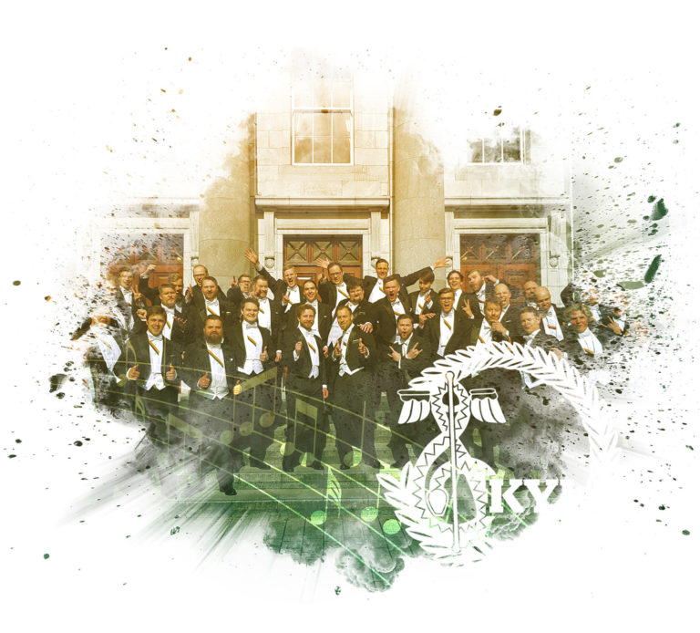
There were many different events throughout the year which had their own visual identities inspired by the main branding, however, the main brand itself only used a couple of images, one catered towards the general audience (formal) and another for students specifically (informal). Examples of these two main assets can be found below
Formal

Informal

Examples
There were numerous events, projects and promotions during the anniversary year, including several concerts and competitions organized by the choir, as well as recruitment events, for which physical banners and rollups were commissioned. Here are a few examples of how and where the visual style and imagery was used during the year.
Concert advertisement and program booklet at the Helsinki Music Centre
The main concert of the year was held at Helsinki Music Centre and was advertised on their advertisement wall. The audience also received a program booklet, which is show below.
KYL Traditional Christmas Concerts
The traditional KYL Christmas concerts mirrored the main KYL70 visual language but it adjusted to fit the theme by using a colder color scheme, snow and a festive Christmas ornament instead of an explosion.
Other material
Other promotional material, such as rollups and banners were commissioned to make the anniversary events more visible, but also to freshen up the promotional material available for the choir even after the anniversary year. Here is a mockup of the formal rollup ordered for the choir. Note that the rollup was meant to be used for years to come so the KYL70 anniversary logo was not included and the official logo was used instead.
Process
The basic process I usually follow with most of my design work was cut a bit short during this project as there was no external client and the brand was created internally. Because of this reason, the discussion and initial ideation were pretty much merged together and I created the logo without any additional revisions. This lead to the creation of the visual identity, which was then used for the other material.
1. Discussion and ideation
Setting the goals for the project and creating initial concept for the logo idea. This was done among the board of directors and I sketched out some initial logo idea during the meeting, which were approved during the same meeting.
2. Creation of the Final Logo
After the approval of the initial design, the logo was very quickly created and presented to the board.
3. Finalizing the Visual Identity
Based on the goals set in the first step, I created the main asset for the brand to be used throughout the year. This meant that I wanted it to represent what KYL stands for: being traditional, but innovative and energetic.
4. Creating other related material
It had been decided that we wanted to order new material to use in any events we participate, either concerts or recruiting events for student. The creation of the banners and rollups was one of the main tasks I would attribute to this step. Other concerts, promotional events and competitions throughout the year adapted a somewhat similar styles as well and followed slightly adjusted guidelines to fit the theme of the event.
What I learned?
This was a longer term project and I learned a lot about how to maintain visual consistency across multiple events and many digital and printed formats. All in all this functioned as a short but complete brand lifecycle and I was there to develop it from start to finish. The creation of usable assets that can be recognized by the audience was a rewarding challenge, and the strong visual identity got great feedback from the audience.
One thing I might want to do differently in future projects has more to do with the execution of the marketing campaign than just the technical details of the branding itself. To give the brand and anniversary even more presence it could have been beneficial to create some sort of a filter that would have been used whenever posting images of the choir to social media. This would have exposed more people to the brand more often and would have helped to created a connected narrative across the different events during the year.