Symphony Orchestra Vivo
Youthful but classy

Brief
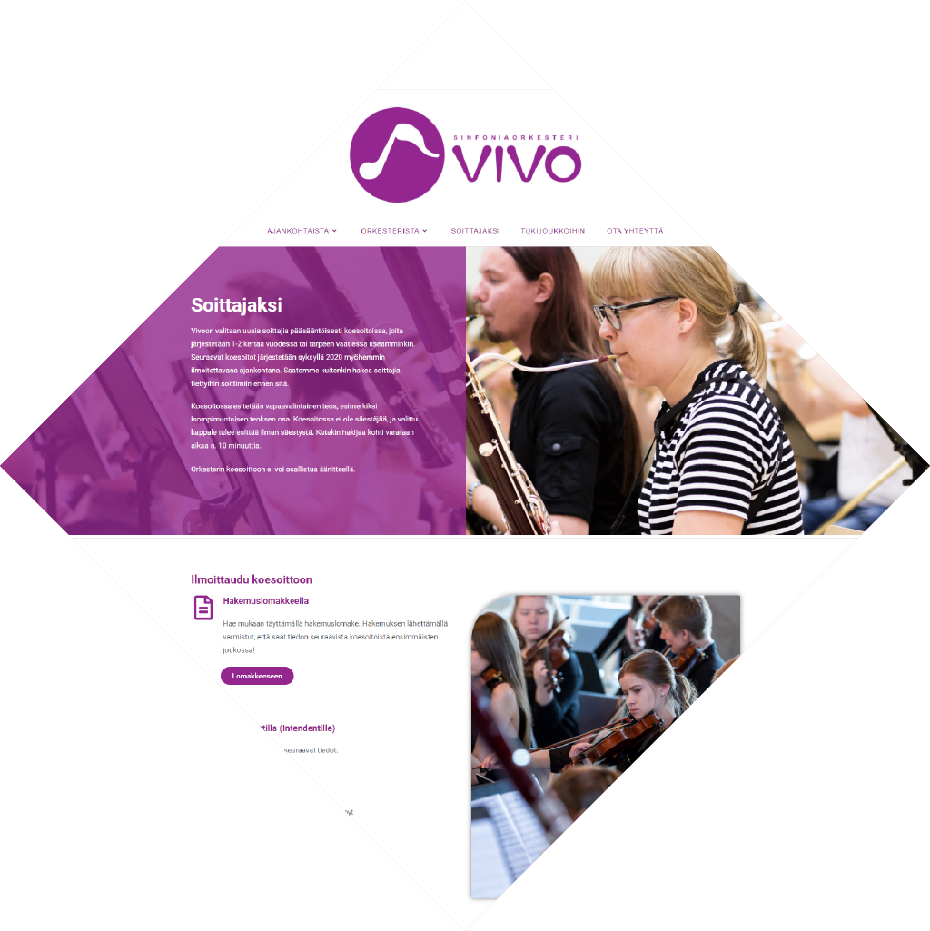
Youth Symphony orchestra Vivo was in a need of new visual identity including logo, as well as a website matching the new brand. The goal was to do a complete overhaul for their look as they felt as the previous design was not matching well with the youthful nature of the orchestra.
Vivo
Symphony orchestra Vivo is a philharmonic orchestra for young players focusing especially on the community built around the hobby. Vivo wants to give young people an opportunity to practice, play and develop as musicians.
Vivo
Symphony orchestra Vivo is a philharmonic orchestra for young players focusing especially on the community built around the hobby. Vivo wants to give young people an opportunity to practice, play and develop as musicians.
See the final result
Here you can access the finished version of the website as it was originally created. The version accessible here was the website after about two years of use.
Logo
There was no intention for this logo to resemble the old logo, as the meaning was to do a complete overhaul for the brand. The central idea behind the logo was to use recognizable visual language familiar to the 15-25 year old players, while still being attractive to their audience, which is more often than quite a bit older. To achieve this I decided to mirror a similar style to many logos often seen in application icons, but not go over the top with colors and shapes. This direction lead me to use round shapes and a stylized version of a musical note to create the logo that can easily be used separately as an icon. This similar visual language was used for the typography of the logo as it is both playful and youthful wile still being classy.
Old
New
Visual identity
What the visual identity for Vivo is aiming to achieve is to appear both youthful and classy. The orchestra needs to be appealing to the young players by convincing them that this is a place for them, as well as the people who consumer classical orchestra music.
Color
The color for the brand I chose was purple, which is a color that represents creativity and imagination. These traits are often to young people, but purple is also associated with quality and even royalty to bring prestige to the orchestra.
Shapes
The main shapes used in the branding of Vivo are round as those appear more youthful compared to sharp edges. This was used on the website as well to create visual interest and catch attention in the middle of the many straight lines present on other parts of the website design.
Imagery
Images used for the visual identity are focused on people instead of grand concert halls to increase the personal nature of the brand. It was also important to include images outside of formal concerts to create a more relaxed atmosphere on the website, which would feel more welcoming for the young players.
Process
This is the basic process I follow with most of my design work. Usually I finalize the visual identity after creating the final logo because then I finally feel like I have all the information needed to connect everything together. After this process I move to any additional work needed, such as creating the website. This process changes only marginally between projects, which means that this section is also very similar to the process sections of the other cases but with minor differences based on the project.
1. Discussion and Benchmarking
Finding out the goals of the project and benchmarking familiar visual languages to the different stakeholder groups such as application icons and common musical iconography to further narrow down the best approach.
2. Initial Ideation
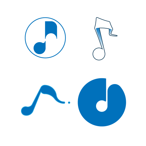
Creation of initial logo ideas and conceptualizing them to have several possible directions for the logo to develop in. These ideas were then presented to the client and the best ones were chosen for further development.
3. Revision Rounds and Final Logo
The aim for this step is to keep narrowing down the logo ideas to the best ones and developing those even further until the final logo design is reached. Number of revisions depends on the project and some of this project’s earlier logo revisions can be found right under this section.
4. Finalizing the Visual Identity
After getting the logo ready the next step was to create a suitable visual identity to match the message infused in the logo considering such things as colors, shapes and imagery while still keeping in mind the usability and applicability of those guidelines. These guidelines were then further utilized in creating the other parts of the commissioned project.
5. Creating Other Components
In this case, the bulk of the work was creating the website itself based on the client’s specifications. They first outlined the basic intended architecture for the site and provided me with the contents they wanted me to include on the site, but after that I had a lot of creative freedom to implement those things to the website. After confirming my plan with the client using a prototype version of the site, I implemented the style and content to the real site.


What I learned?
Especially in this project benchmarking was hugely important as I don’t personally belong to either of the main target audiences and I can admit being “a bit out of the loop” of a few aspect of especially the youth culture. However, the visual identity needed to translate well to many audiences and for that benchmarking visual languages of other orchestras and application logos was extremely helpful.
On top of that, this was my first major project working on creating a website from scratch, so there was a huge amount of things I learned from the experience. To highlight a few, on the website I specifically focused on the user experience and ease of use along with implementation of the visual identity across the site. I aimed to create a site that would be easy to use and understand whether you are using the front or the back end of the site, and as the feedback from the client would indicate, they felt that I was successful.
Testimonial

We renewed our visual identity and website at the same time. Lauri understood our needs and had very good ideas of how to do a cost-efficient yet nice looking identity and easily manageable web site for our orchestra.
Mikko Leppänen, perviously Intendant at Symphony Orchestra Vivo
Image: Jari Heikkilä
